The change in seasons has invigorated me to make undertake a more structured (and ultimately more useful) approach to Constructioneconimics.org, as I shall expound below:
To start with, you will soon notice some pleasing (and much needed) aesthetic modifications to the site including a new logo (which may or may not look something like the one below that I have just whipped up on Excel in an attempt to generate some interest!), new colours, and an updated theme.

More importantly, I am starting some new mini-projects that will warrant systematic weekly and monthly uploads, namely:
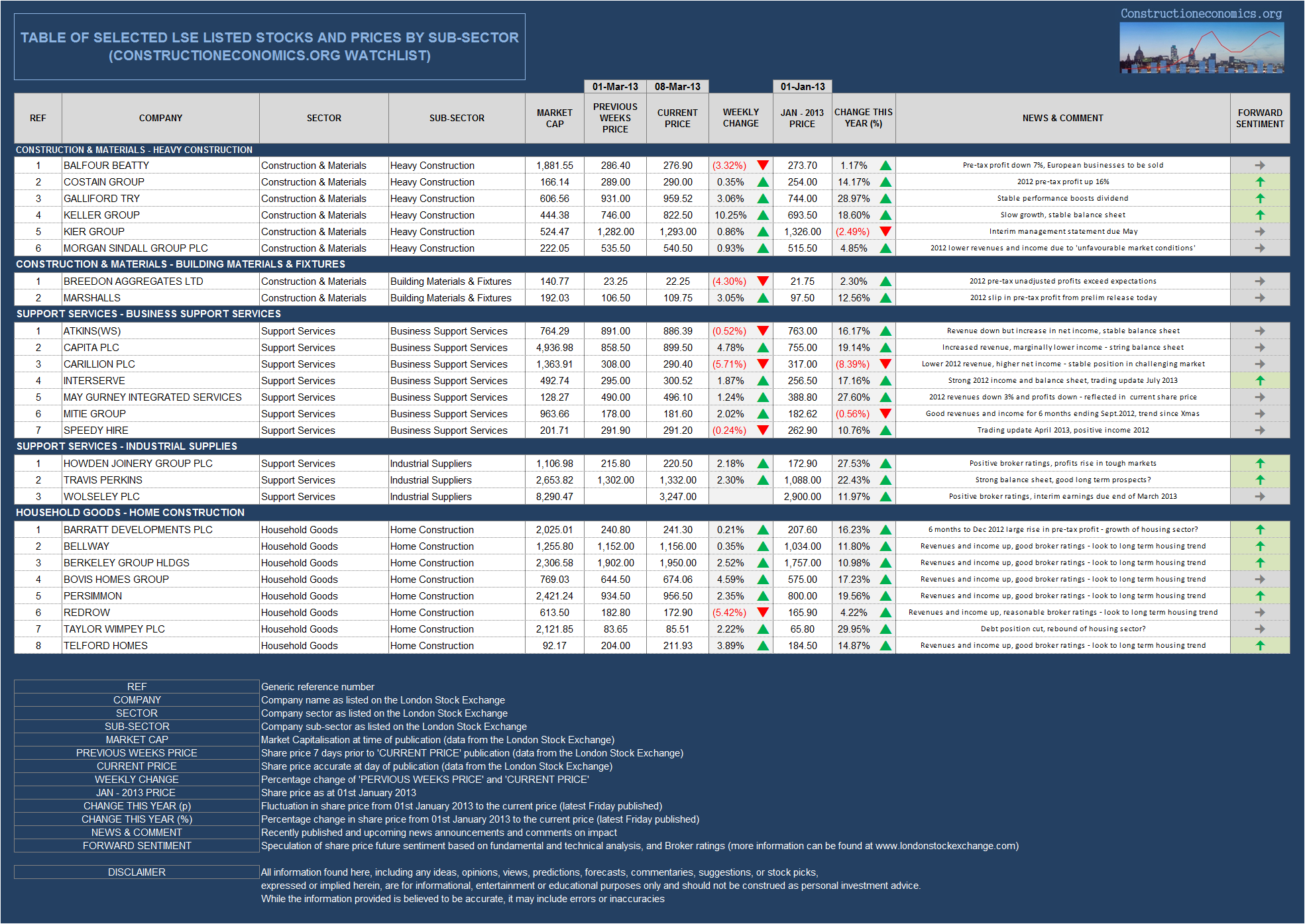
– Tabulated and visualised share price data relating to UK listed Construction & Materials, Support Services, and Real Estate companies. This will include weekly fluctuation in share price and some nifty visuals. I hope this table will eventually become interactive once I have gained sufficient web coding power!
– Weekly share price heat maps of the above companies. Again, this will hopefully become interactive after a few months.
– Company Click – a detailed monthly insight into a selected company, which will include a bio, some visualisations and charts of historic stock performance, speculation on future price and investment ideas.
– Interactive map of UK construction – more on this to follow in the coming months (this is rather ambitious undertaking and may take a bit longer to galvanise).
So there you have it. The new features will of course be interposed with the usual visualisations and commentary on interesting construction data and the like. I will tweet about new posts as and when they happen (@guy_beaumont). Any questions or comments are, or course, very welcome.